











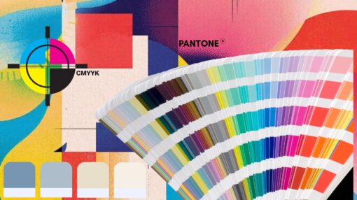
Pantone and CMYK: What Do They Mean — and Why They’re Important for Your Brand
Brand colours play a key role in recognition and consistency. However, colours can appear differently depending on how and where they are printed.Two colour systems are commonly used in printing and promotional products: CMYK and Pantone. Understanding the difference between them helps set clear expectations and avoid colour inconsistencies across different print methods.
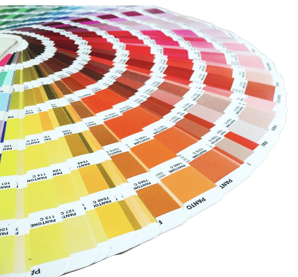
What Is a Pantone Colour?
- Colours are mixed using a standard formula
- Results are consistent across different printers and suppliers
- Designed for solid ink printing processes
Pantone colours are commonly used for:
- Screen printing
- Pad printing
- Embroidery
- Plastics and coated materials
- Promotional products and merchandise
- Pantone is typically required when products cannot be digitally printed, or when a solid ink colour must be specified.
Pantone is typically required when products cannot be digitally printed, or when a solid ink colour must be specified.


What Is CMYK?
CMYK is primarily used for:
- Digital printing
- Offset printing
- Flat, paper-based materials such as brochures, flyers, and posters
Because CMYK colours are visually created rather than pre-mixed, the final appearance can vary depending on:
- Print equipment
- Substrate or material
- Print method
These variations are a normal characteristic of CMYK printing.


Why CMYK Doesn’t Always Work for Screen or Pad Printing
These processes:
- Use solid ink colours
- Cannot accurately recreate CMYK dot patterns
- Often require Pantone inks instead
This means:
- A CMYK colour may not exist as an exact Pantone match
- Some digital colours cannot be replicated 1:1 on physical products
When Pantone references are not supplied in brand guidelines, printers must visually match the closest Pantone colour. These selections then require customer approval prior to production.

What Should Be Included in a Brand Guide (for Printers)?
For brands producing merchandise, uniforms, or promotional products, a brand guide should include:
- Pantone colour references (primary and secondary colours)
- CMYK values (for digital and offset print use)
- RGB and HEX values (for screen and web use)
- Notes outlining which colours are approved for merchandise and non-digital printing
Including this information avoids guesswork and helps ensure consistent colour application across all products.
Why This Matters?
Pantone references helps:
- Reduce colour interpretation differences
- Improve consistency across non-digital print methods
- Provide clearer direction to printers
Final colour approval remains the responsibility of the brand owner or marketing team.
Branding Colours
Learn more about branding colour on promotional products & merchandise.


Artwork and Logo Requirements
Learn more about artwork for print on promotional products
Pantone vs CMYK
In Summary
- CMYK is designed for digital and paper printing
- Pantone is required for many screen-printed and pad-printed products
- Not all colours translate exactly between systems
- Pantone selections must be reviewed and approved by the client
Understanding these differences helps set clear expectations and supports more consistent print outcomes.
CMYK
- Built from four inks
- Used for digital & paper print
- Appearance may vary
Pantone
- Pre-mixed solid inks
- Used for non-digital printing
- Greater consistency

Looking for a merchandise branding specialist?
Talk to our professional branding services team today!.
Need inspiration for your event?

Subscribe to our blog for the latest trends, early sale access, promotions, and more.
Join the club.
